Vehicle Market Analysis - Visualization & Predictions
In this project, I will analyze a vehicle dataset available on Kaggle, focusing on exploring market trends through data visualization and developing a predictive model using training and test datasets.
This article presents the project in a polished, professional manner. Contact me if you would like further informations.
Visualizations : What is the best market strategy
In this project, I analyzed a vehicle dataset from Kaggle to uncover market trends, focusing on various aspects such as car distribution by year, maker, and price. Through detailed data visualizations, including histograms, bar plots, pie charts, and scatter plots, I explored the key insights driving the automotive market. This analysis not only reveals the most prominent car brands but also sheds light on market strategies that balance volume and pricing.
You can find, download and modify all my code on my Kaggle :
Visualizations : What is the best market strategy
Data Overview and cleaning
The dataset consists of 2059 rows and 20 columns, providing information about vehicles such as make, model, price, year, mileage, fuel type, transmission, location, and more. Before diving into the analysis, the data required some cleaning:
- Handling Missing Values: We observed missing data in several columns, including engine specifications, dimensions, and seating capacity. To maintain data consistency, columns with missing values were dropped, reducing the dataset to 11 columns.
- Duplicate Rows: We also removed any duplicate entries to avoid skewed results, keeping 2059 unique rows for analysis.
Data Visualization
Cars Distribution by Year
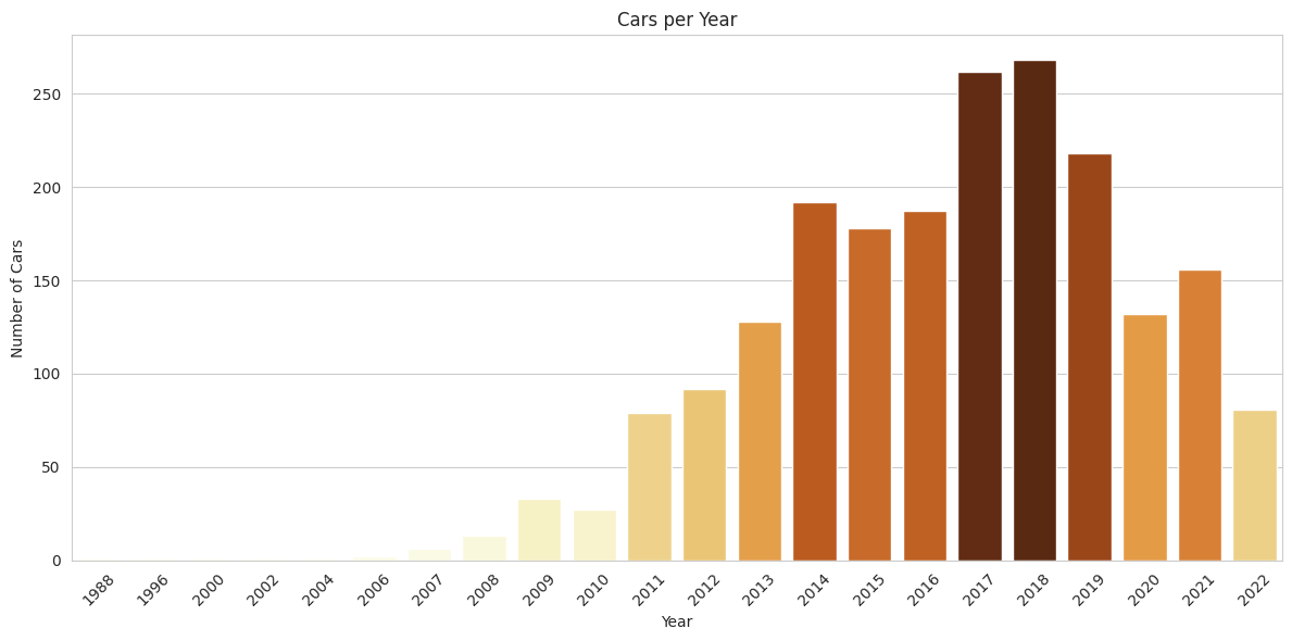
To visualize the distribution of cars by their manufacturing year, a bar plot was used. The plot reveals that most of the cars were produced in the last decade, with a noticeable drop in production after 2020. This is likely due to the global impact of the COVID-19 pandemic, which disrupted car manufacturing and sales.
Here’s an example of my code. To highlight the years with the highest concentration of cars, I applied a normalization technique to scale the values. This allowed me to create a custom color palette where darker shades represent higher concentrations :
# Plotting the number of cars per year using a bar plot
# This shows how many cars were made each year in the dataset

plt.figure(figsize=(12, 6))
# Counting cars per year
cars_by_year = cars_data['Year'].value_counts().sort_index()

# Normalize the values to use them for coloring (0 to 1)
normalized_values = (cars_by_year.values - cars_by_year.values.min()) / (cars_by_year.values.max() - cars_by_year.values.min())

# Create a custom color palette based on the normalized values
colors = sns.color_palette("YlOrBr", as_cmap=True)(normalized_values)

# Bar plot with "colors" color palette, highest values are, more they will be dark
sns.barplot(x=cars_by_year.index, y=cars_by_year.values, palette=colors)

plt.title('Cars per Year')
plt.xlabel('Year')
plt.ylabel('Number of Cars')
plt.xticks(rotation=45)
plt.tight_layout()
plt.show()
Cars Distribution by Maker
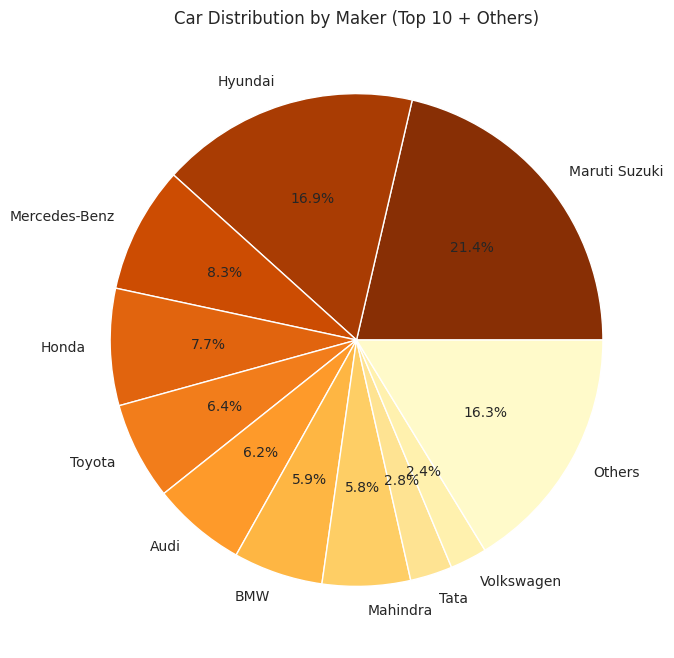
A pie chart displaying the distribution of cars by maker shows that a handful of brands dominate the dataset. Maruti Suzuki, Hyundai, and Honda lead in terms of volume. These brands offer a high number of vehicles, reflecting their strong market presence.
Cars Distribution by Price
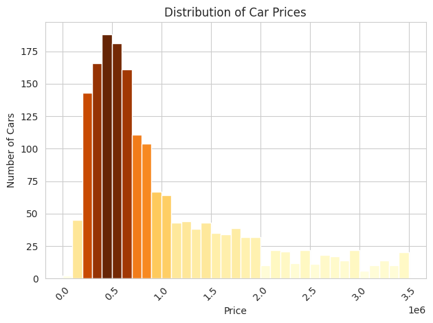
The distribution of car prices reveals that the majority of cars are priced below 1 million units of unknown currency. The data shows that most cars are clustered around half a million, with a few outliers priced significantly higher. This suggests that luxury cars have a limited yet significant presence in the dataset.
Average Car Price by Maker
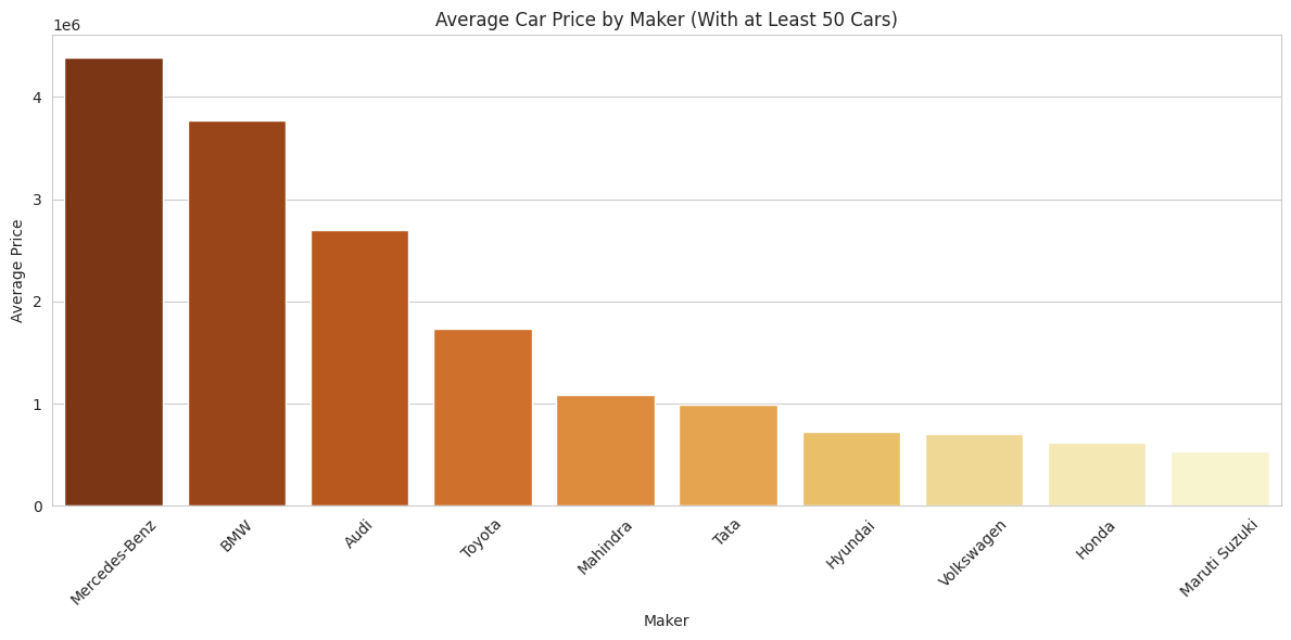
Among makers with at least 50 cars in the dataset, Mercedes-Benz, BMW, and Audi command the highest average prices. These brands are known for their luxury vehicles, reflecting their premium pricing strategy. On the other hand, Hyundai and Maruti Suzuki offer more affordable vehicles, driving higher sales volumes at lower price points.
Market Strategy Analysis
A deeper look into the market strategy reveals that the German brands (Mercedes-Benz, BMW, Audi) combine high prices with substantial sales volumes. This balanced approach allows them to dominate the high-end market. Meanwhile, brands like Hyundai and Maruti Suzuki focus on high-volume, lower-priced vehicles, leading to significant total sales as well.
Top 10 Car Brands by Total Sales
Mercedes-Benz leads the market with nearly 750 million in total sales, followed by BMW and Audi. Interestingly, Hyundai and Maruti Suzuki also feature in the top 10, despite their lower average prices, thanks to their high volume of vehicle sales.

Market Share Analysis
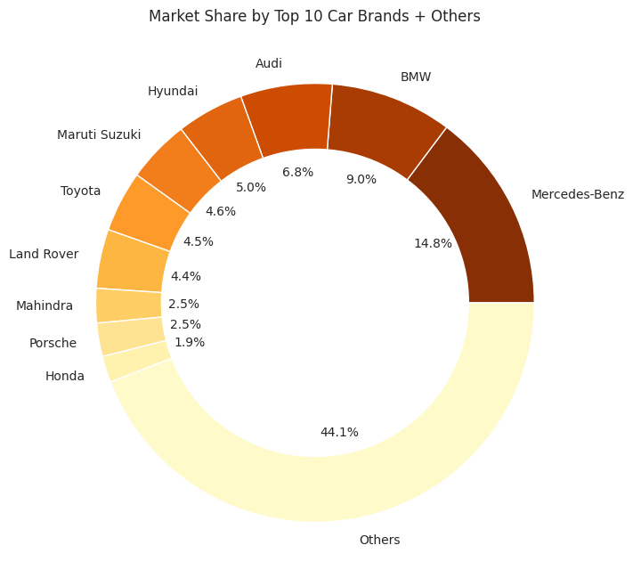
A donut chart visualizing market share shows that the top 10 brands collectively control a larger portion of the market compared to the remaining 23 brands. Mercedes-Benz holds nearly 15% of the total market share in terms of sales.
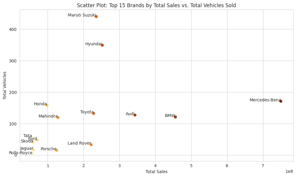
Top 15 Brands by Total Sales vs. Total Vehicles Sold
This chart offers insights into the different strategies these brands use in the market. While some focus on high volume at lower prices (e.g., Hyundai, Maruti Suzuki), others focus on luxury and higher pricing with lower volume (e.g., Mercedes-Benz, Audi, BMW).
Key Insights & Conclusion
The analysis demonstrates several interesting trends:
- German Brands like Mercedes-Benz, BMW, and Audi adopt a high-value, balanced volume strategy that leads to significant market dominance.
- High-Volume Brands like Hyundai and Maruti Suzuki focus on affordability, leveraging large sales volumes to generate impressive total sales figures.
- Outliers like Porsche and Land Rover achieve strong sales with a small number of vehicles, emphasizing the value of their luxury brand positioning.
While the dataset provides valuable insights, it's important to note that production costs are missing, which would be critical for determining profitability. Nevertheless, this analysis offered an excellent opportunity to apply various data science techniques, from data cleaning and visualization to normalization and aggregation.
This project highlights how data-driven insights can be used to inform market strategies in the automotive industry, whether it involves focusing on high-end luxury sales or mass-market affordability.
Car Price Predictions : How to improve models
You can find, download and modify all my code on my Kaggle : Car Price Predictions : How to improve models
Soon...
Copyright © 2026
